Case Study
Vaccine Assistant
A cloud-based system for vaccine management that manages appointments distributes vaccines and enhances productivity for healthcare workers.

Category - Product Design
Client - ShareCare
Role - Lead Designer
Responsibilities - End-to-end UX & UI Design Process
Collaborators - Product, Research, Business, Legal, and Engineering
User Research Wireframes Prototyping Usability Testing Product Management
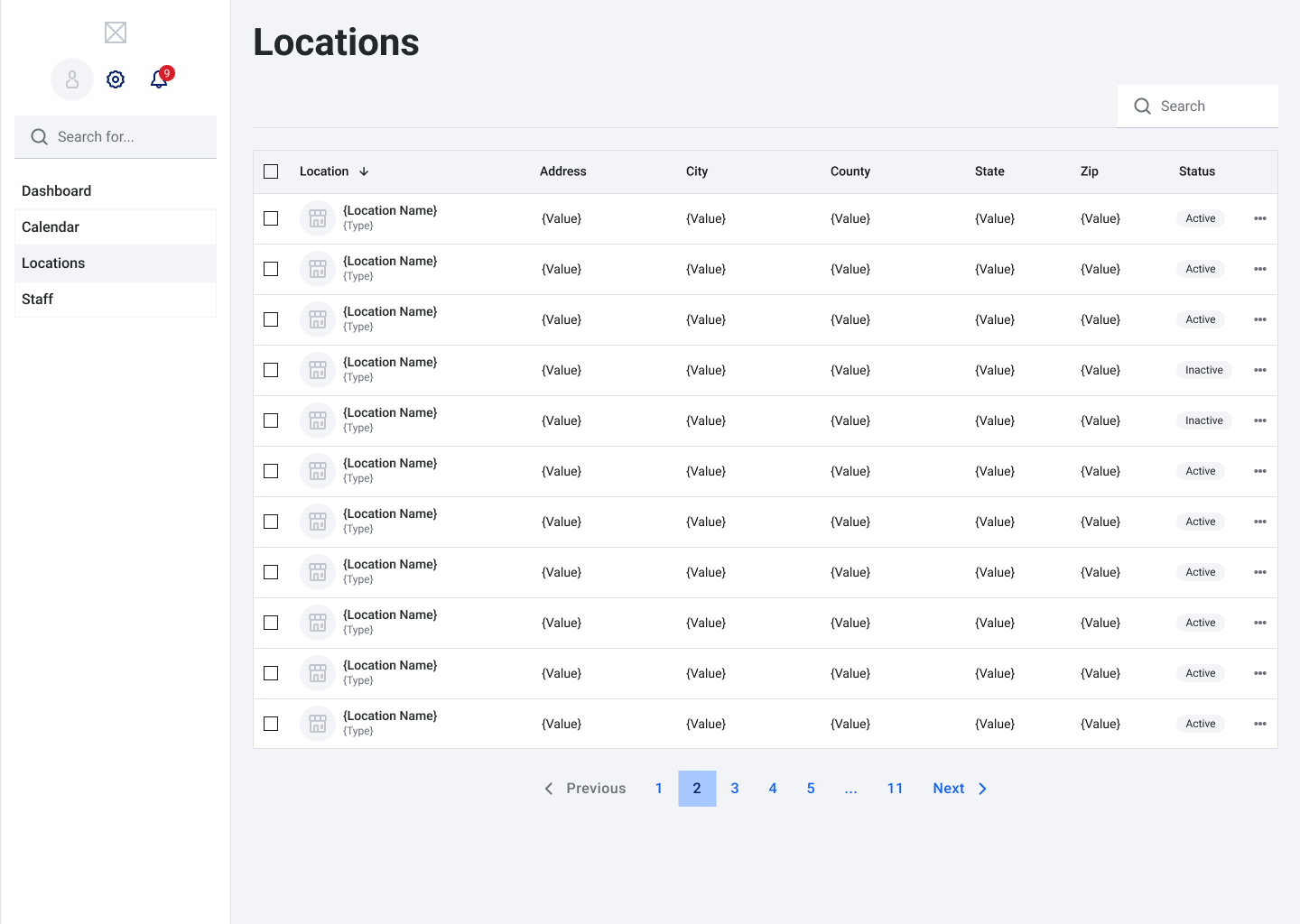
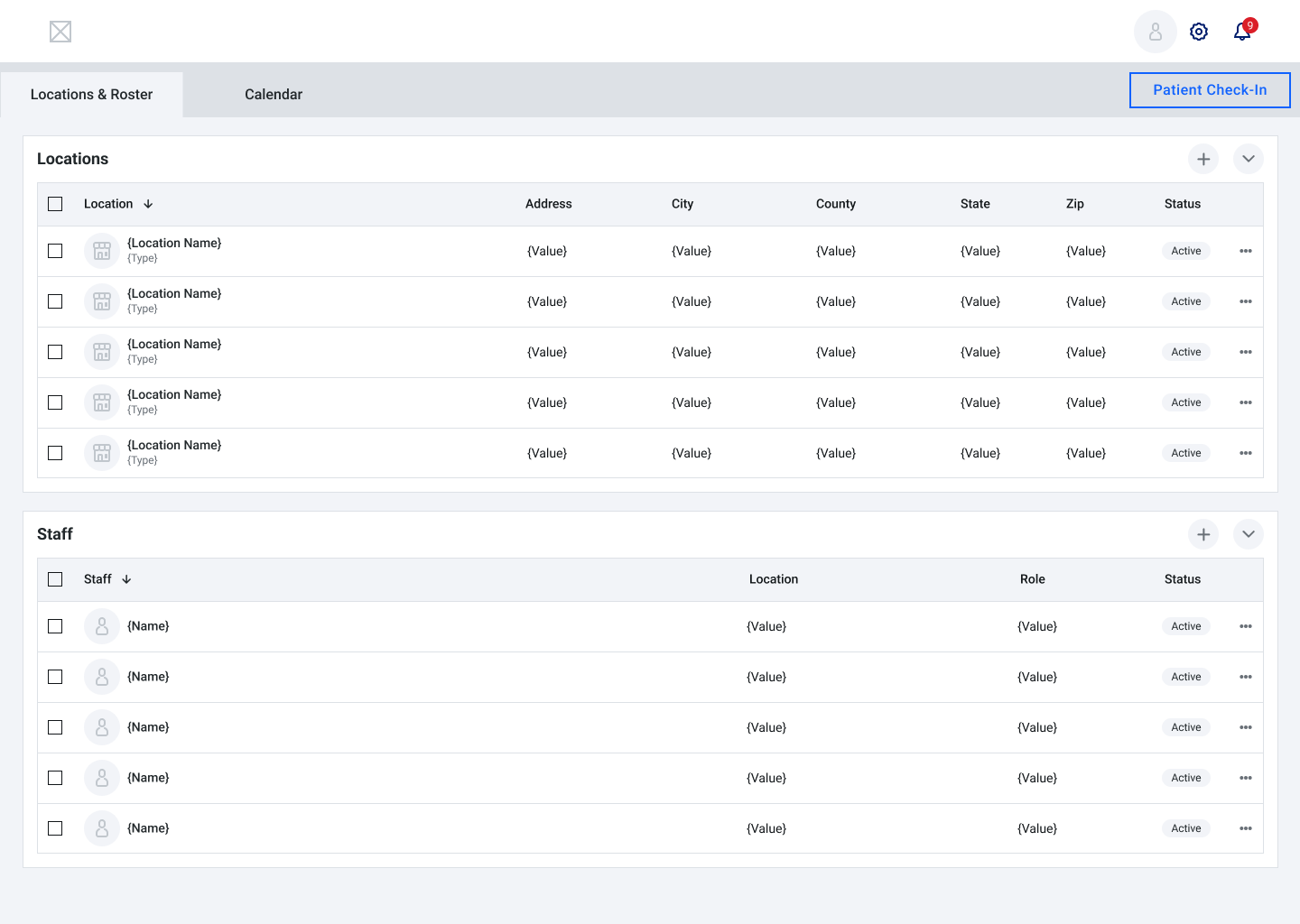
The Problem
Vaccine Access Wasn’t Equally Accessible
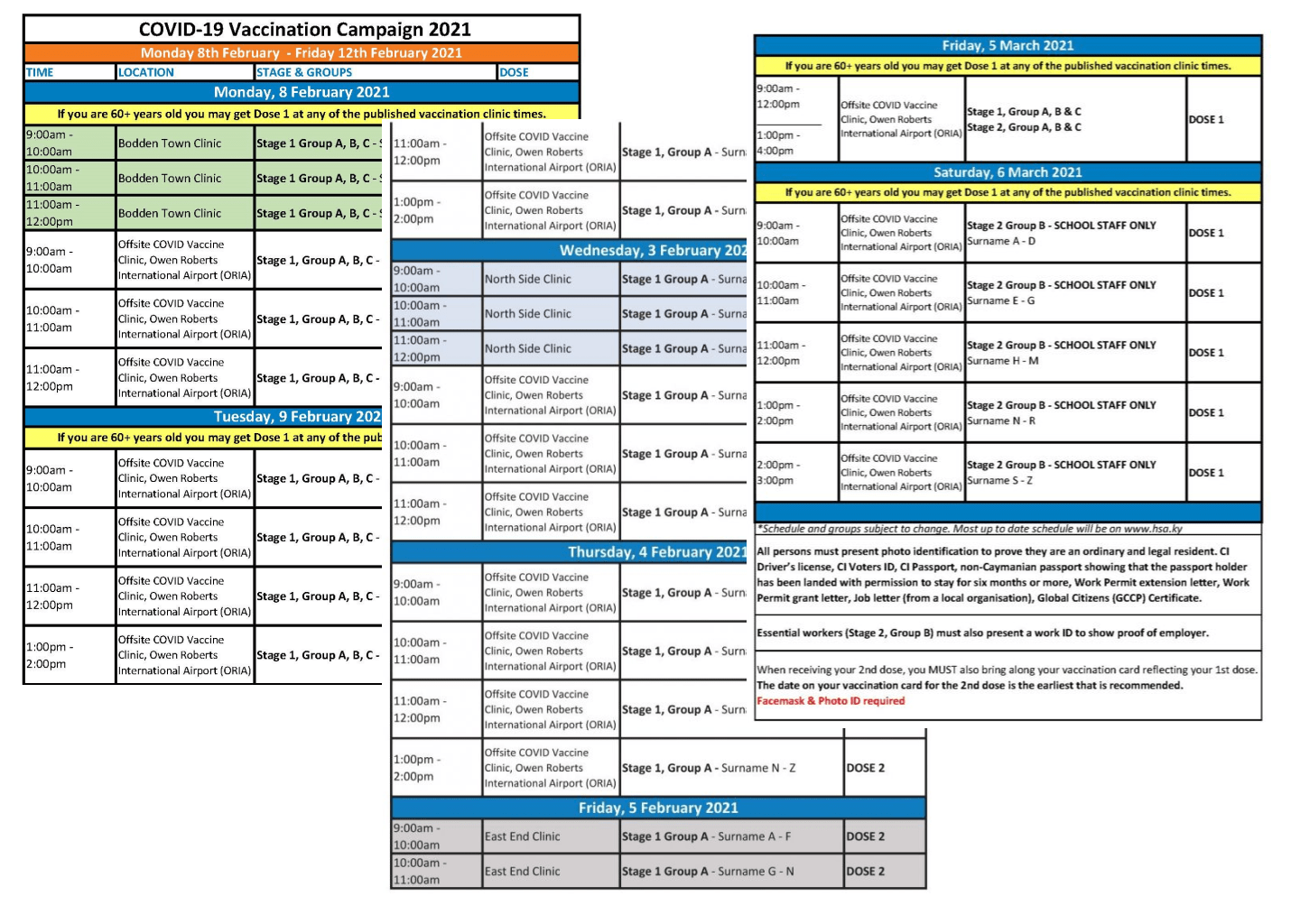
During the COVID-19 vaccine rollout, many individuals struggled to schedule appointments due to poorly designed digital portals. These systems were often cluttered, confusing, and not optimized for mobile — creating unnecessary friction for people with limited digital literacy or unreliable internet access.
" We had to rely on online spreadsheets to manage what we could. Important information was lost or overwritten. Also, some vaccines were misplaced and thrown away because of their short expiration dates. "
The Opportunity
Could a mobile-friendly, web-based tool make it easier to schedule vaccines?
I set out to design a clear, minimal scheduling assistant that made it easy for anyone to complete the task quickly and confidently.
Empathizing with Real-World Barriers
Research focused on individuals who encountered challenges navigating traditional vaccine portals, including older adults, people with low tech literacy, and those relying on slower or outdated devices. Key findings included:
- Complex interfaces led to abandonment.
- Dense forms and unclear eligibility rules caused confusion.
- A lack of trust in unfamiliar platforms created hesitation.
Defining User Needs
From this research, I identified several core user needs:
- "I want to know if I’m eligible."
- “I want to find an appointment nearby.”
- "I want the steps to be clear and easy to follow."
These needs helped guide the product's flow and visual design from start to finish.
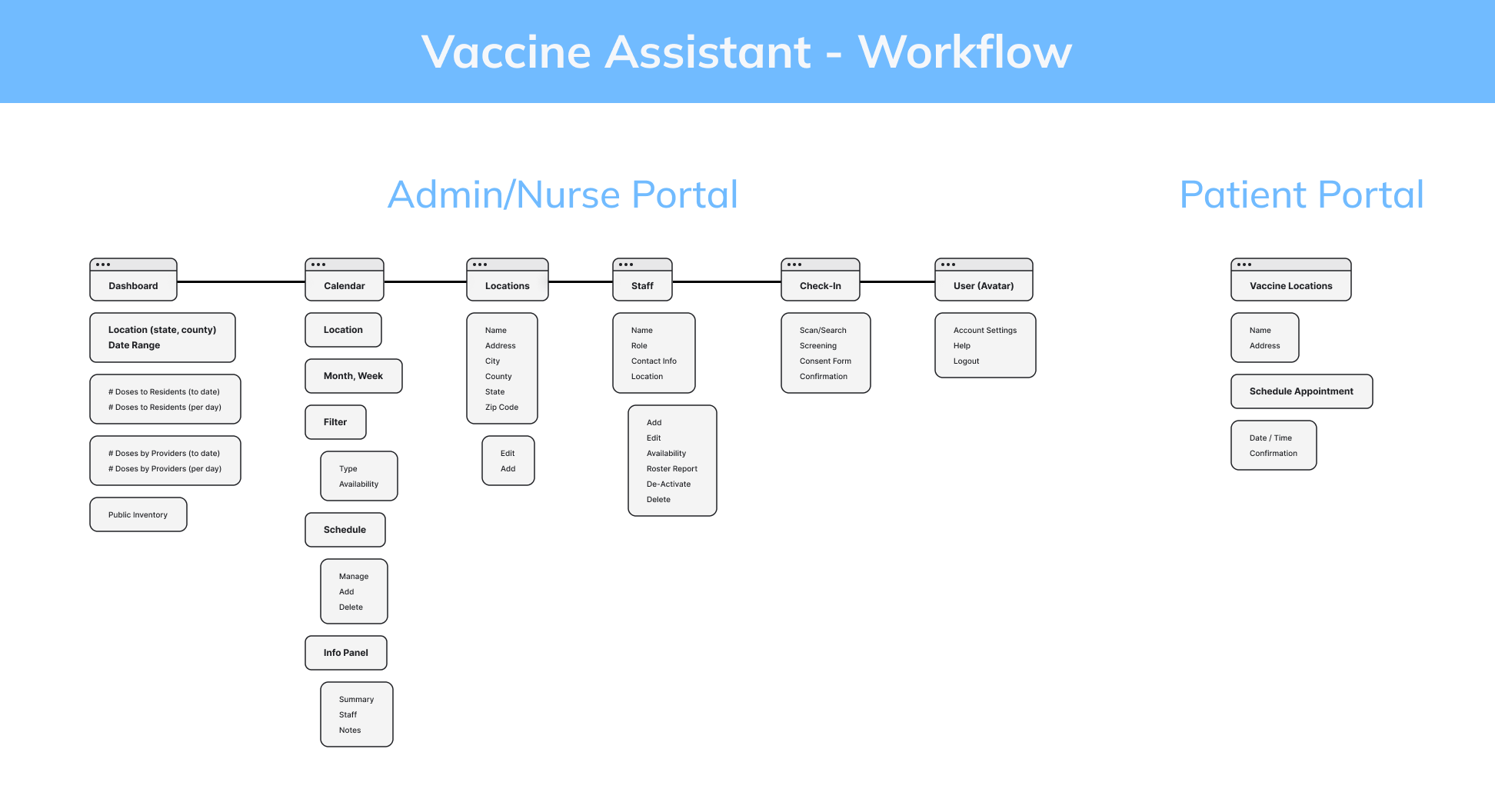
Ideation & Flow Simplification
I explored low-friction user flows, sketching multiple interface ideas with a focus on reducing cognitive load.
Priorities included:
- A conversational, step-by-step approach instead of overwhelming forms.
- Clear, progressive disclosure to guide the user with minimal effort.
- Familiar UI patterns for faster recognition and task completion.

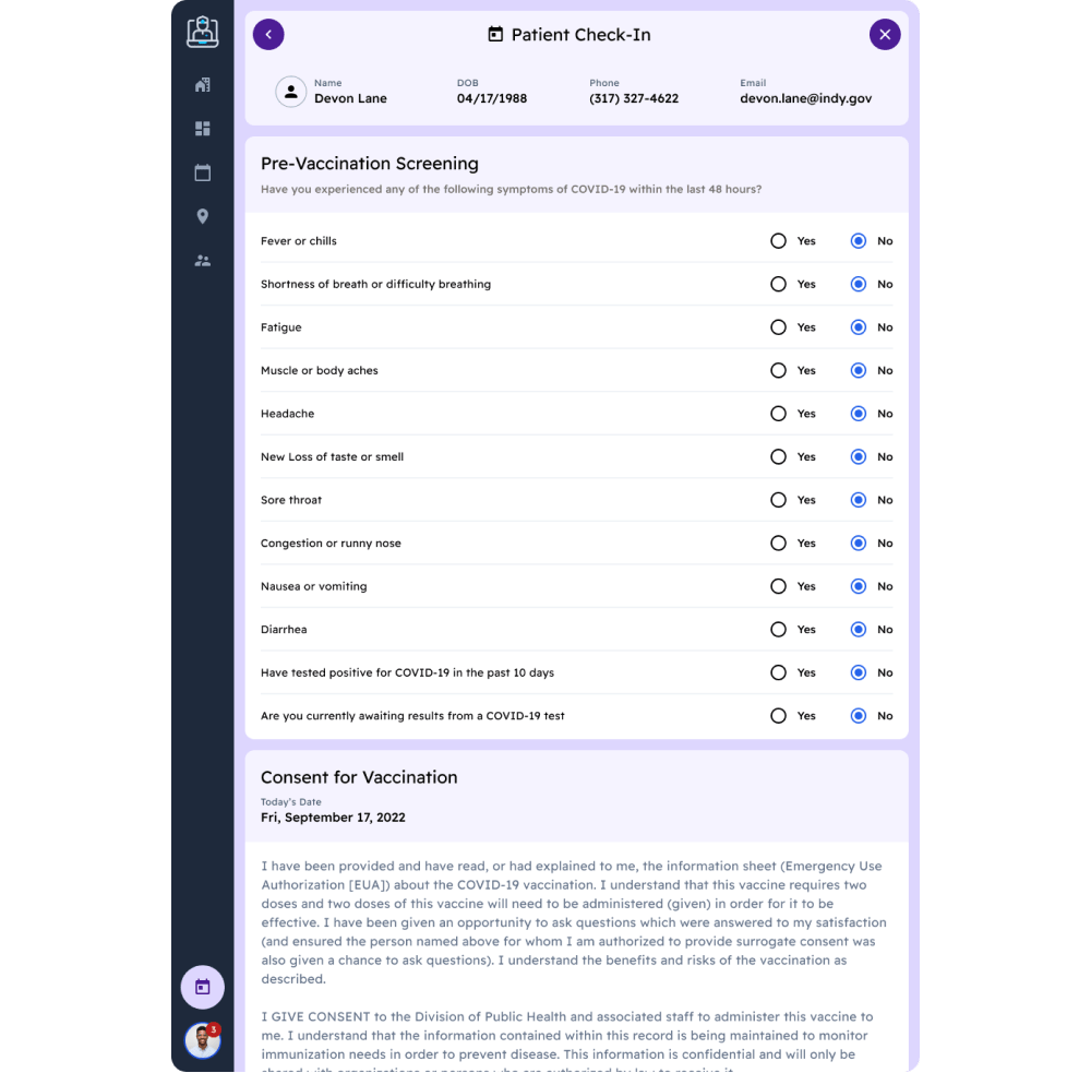
Designing for Clarity and Calm
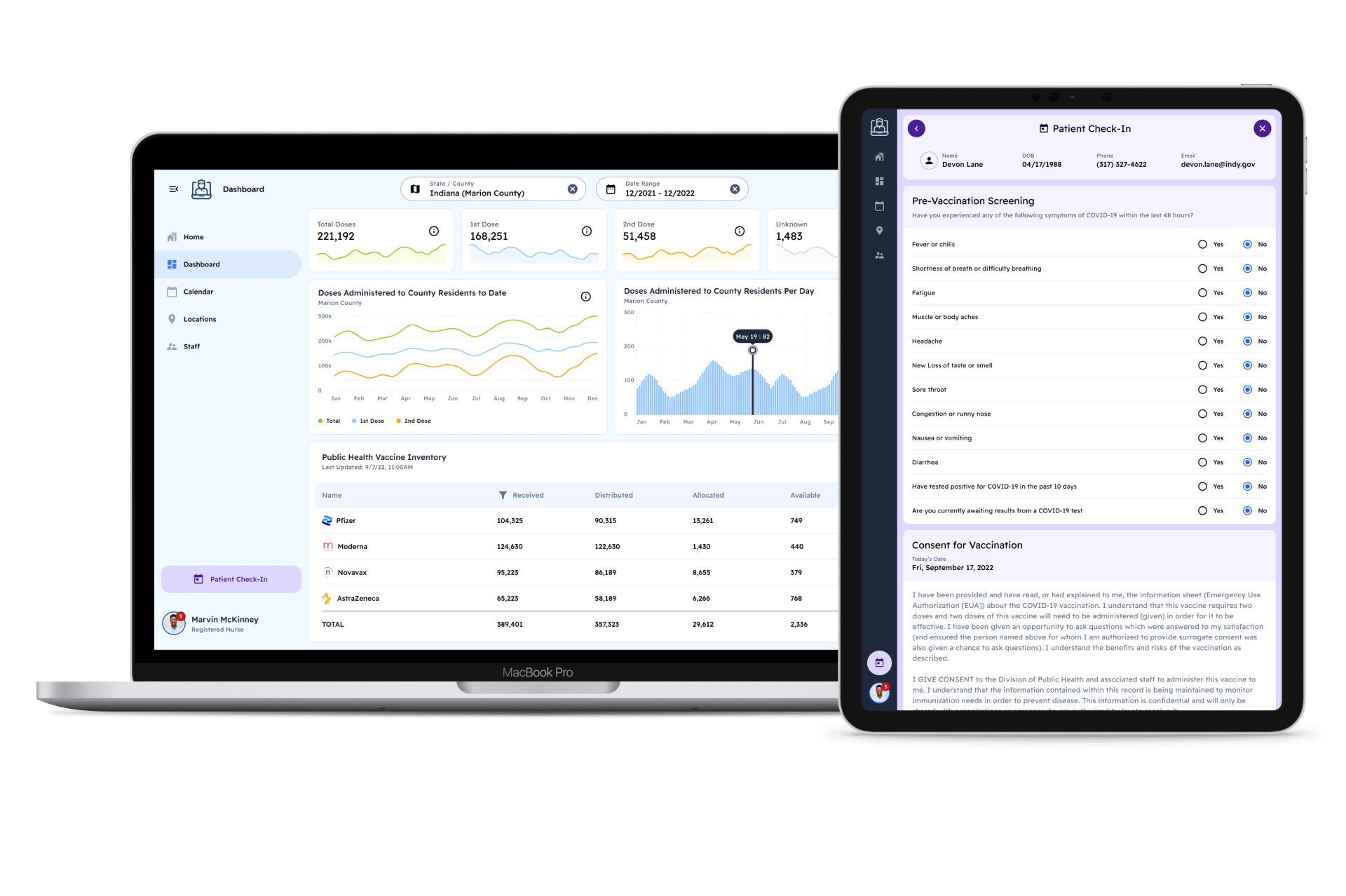
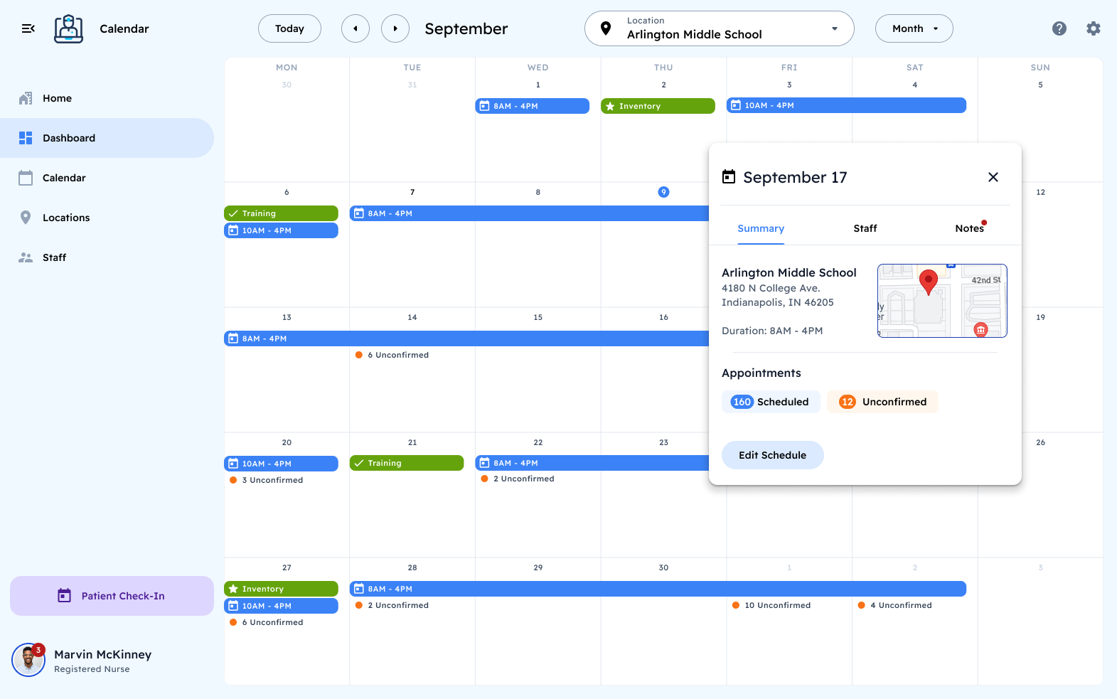
The final UI adopted a minimalist approach to minimize visual clutter and reduce overwhelm. Large tap areas, high-contrast text, and clearly labeled actions made it easy to move from screen to screen. The experience was designed to feel intuitive and calming, especially under time-sensitive or stressful conditions.

The development team used React as the client-side framework. To optimize the build, I adapted the style to align with the components available within the Material UI React library.
Takeaways
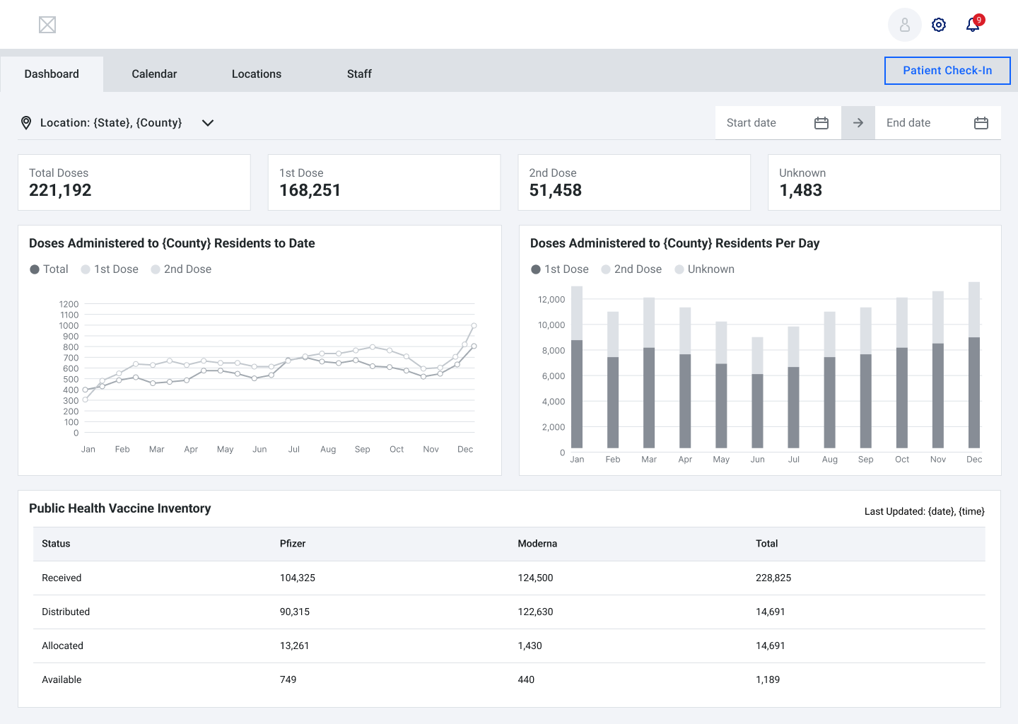
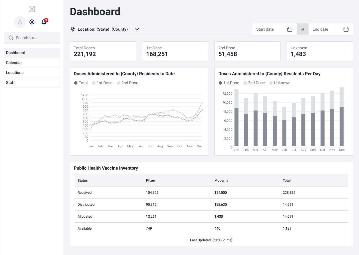
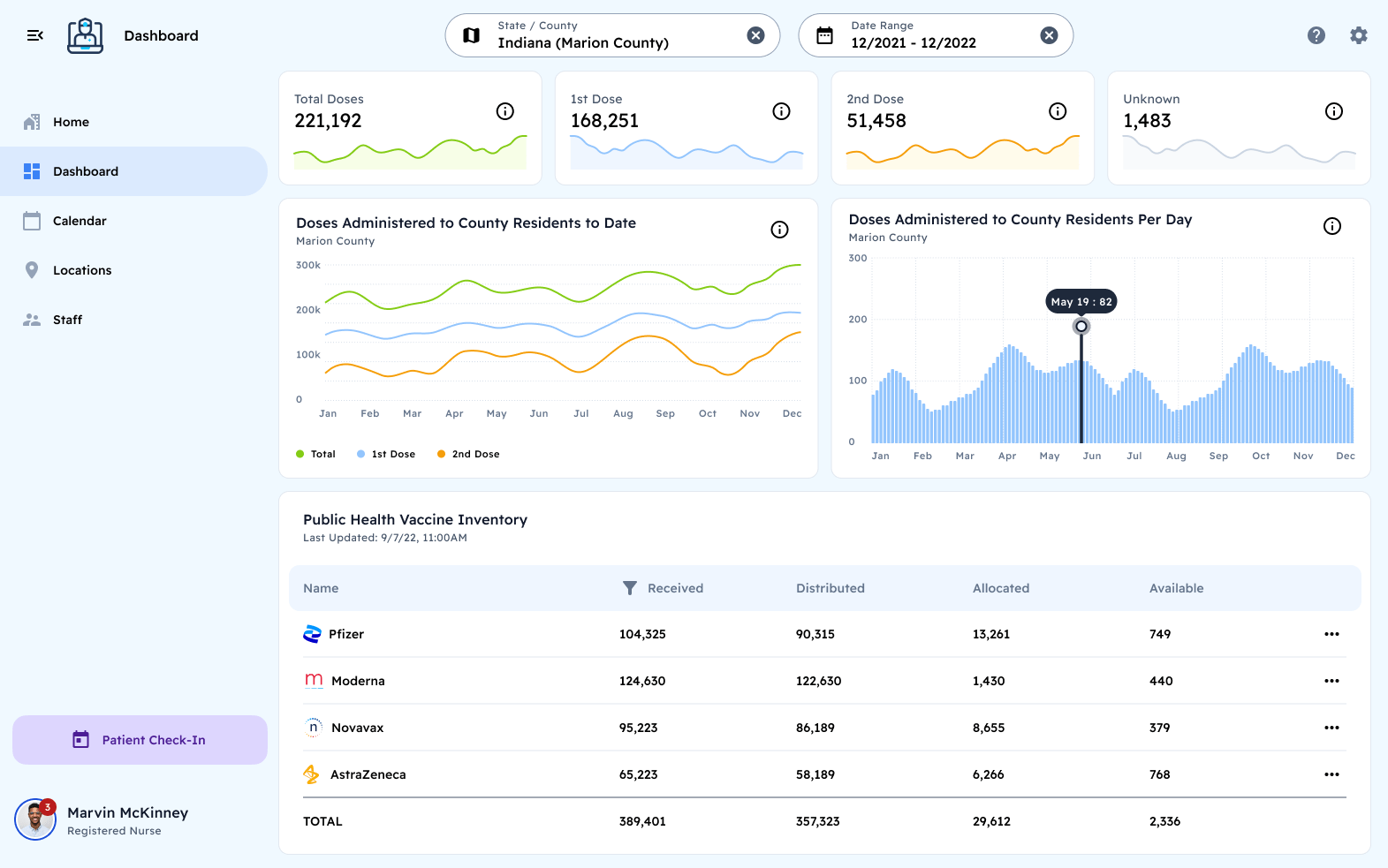
Vaccine Assistant was introduced as a white-label solution for healthcare providers during the height of the pandemic. It significantly increased the speed and efficiency of medical staff by reducing manual and repetitive tasks. As a result, they could focus more on patient care and provide faster treatment.
Achievements:
- Eliminated paper waste, by transitioning to the cloud.
- Reduced wait times for patient care.
- Reduced the disposal of unused vaccines.
What I Learned
This project highlighted the importance of designing for users with varying degrees of digital comfort. Simple, focused interfaces can have an outsized impact when they reduce anxiety, minimize friction, and respect the user’s time.
" I can spend more time getting the vaccines to people who need it most. "
" This application is so intuitive that I won't miss using a spreadsheet! "
" I like how streamlined the check -in process is now; no more dealing with clipboards! "
What’s Next
The Vaccine Assistant demonstrates how a clear, mobile-first design can simplify essential tasks. These principles — progressive disclosure, focused UI, and minimal cognitive load — can be applied to a wide range of public service tools, from appointment scheduling to resource lookup.