Case Study
CounterWorks (Catalog)
Bringing parts search into the flow of real work.

Role: Lead Designer
Scope: End-to-end UX & UI
Collaborators: Product, Business, and Engineering
The Hook
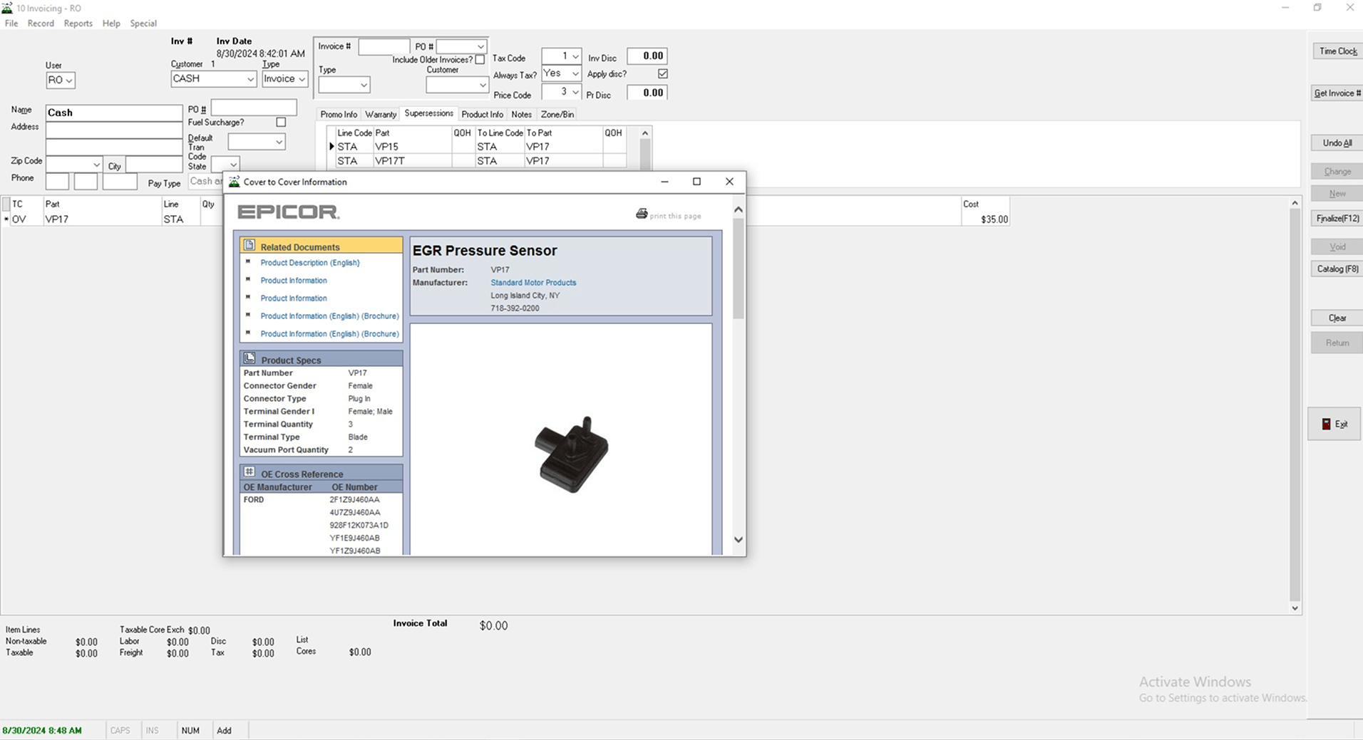
The original CounterWorks catalog experience felt like an afterthought. It lived in a small third-party window that popped up on top of the main POS. It looked different. It behaved differently. And when it lagged, everything slowed down.
It was also tied to a single provider with rising per-seat costs. As stores expanded, that pricing model became harder to justify.
Counter staff did not just need a better search.
They needed a catalog that felt like it belonged in the system they used all day.
Hey there!
Make sure to review the CounterWorks Case Study for additional context.
The Context
CounterWorks is the main POS and inventory system for auto parts retailers. Catalog data comes from third-party providers that follow ACES and PIES standards set by the Auto Care Association. The data itself is standardized and open. The experience was not.
The legacy implementation required users to open a separate desktop window to search for parts. It was visually disconnected, depended on internet stability, and was limited to a single provider that controlled pricing.
The opportunity was clear.
Build a fully integrated catalog within CounterWorks that supports multiple providers and integrates seamlessly with the new POS.
The Problem (Reframed)
What users experienced
- A dense catalog screen in a separate pop-up window.
- A completely different UI from the main POS.
- Extra steps to move part data into a customer order.
- Occasional freezing or slow responses.
What the system caused
- Context switching between the POS and the catalog window.
- Broken flow when the third-party tool stalled.
- Limited flexibility due to single-provider dependency.
The real issue was not just usability. It was fragmentation. The catalog felt bolted on, not built in.
The Design Question
How might we let counter staff search across catalog providers and manage orders without ever leaving the customer workflow?
The goal was simple.
Keep them in one system. One flow. One mental model.
The Investigation
I spent time observing counter staff during live interactions. Phones rang. Customers asked follow-up questions. Orders changed mid-search.
What I learned
- The small pop-up window created friction every time it opened.
- Copying parts from one window to another felt clumsy.
- If the internet lagged, the entire flow paused.
- Staff often repeated searches because the context was lost.
The catalog was not just a lookup tool.
It was part of the conversation happening at the counter.
That meant it had to feel instant, stable, and fully integrated.
The Turning Point
The turning point came when we stopped thinking of the catalog as a tool and started thinking of it as part of the order itself.
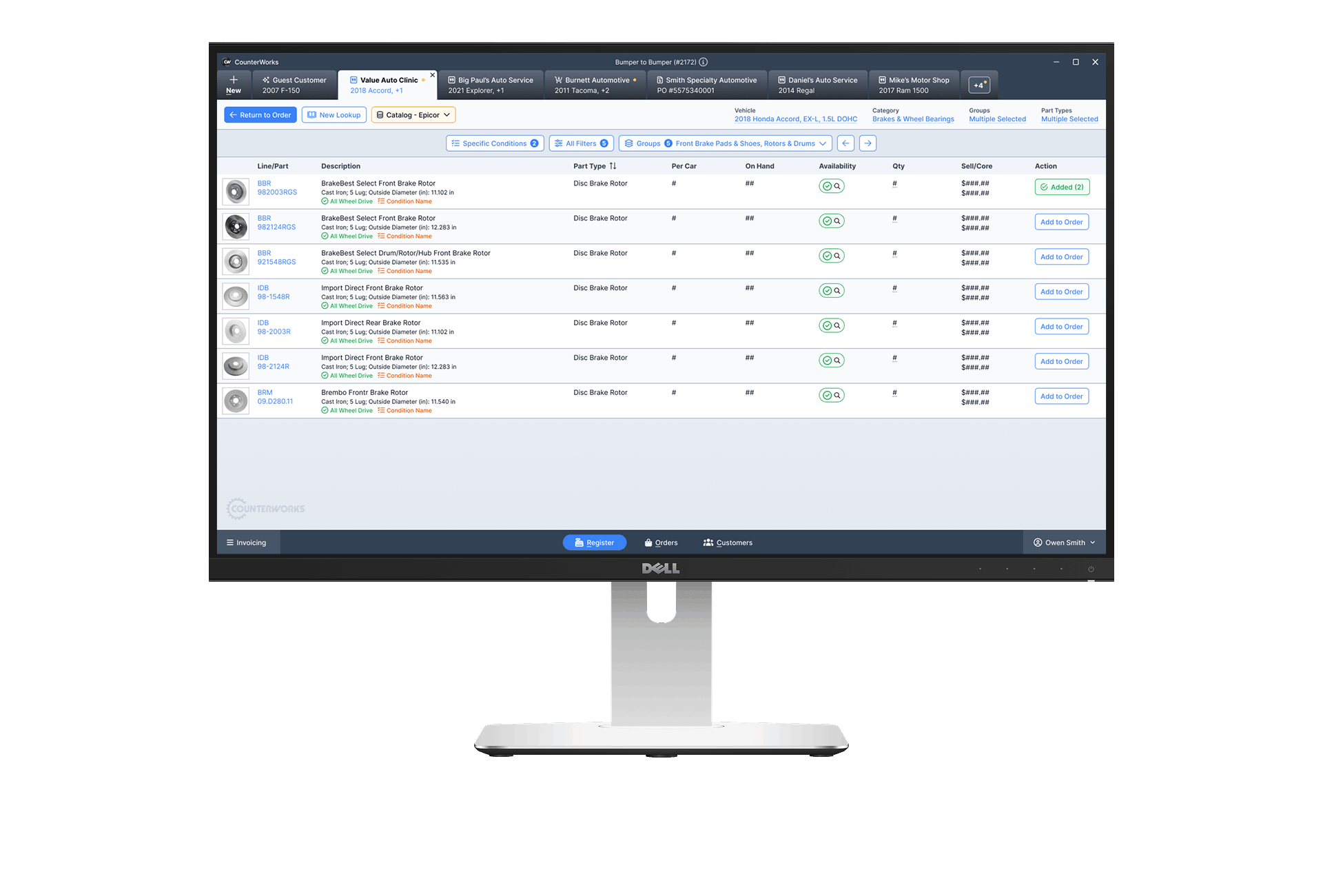
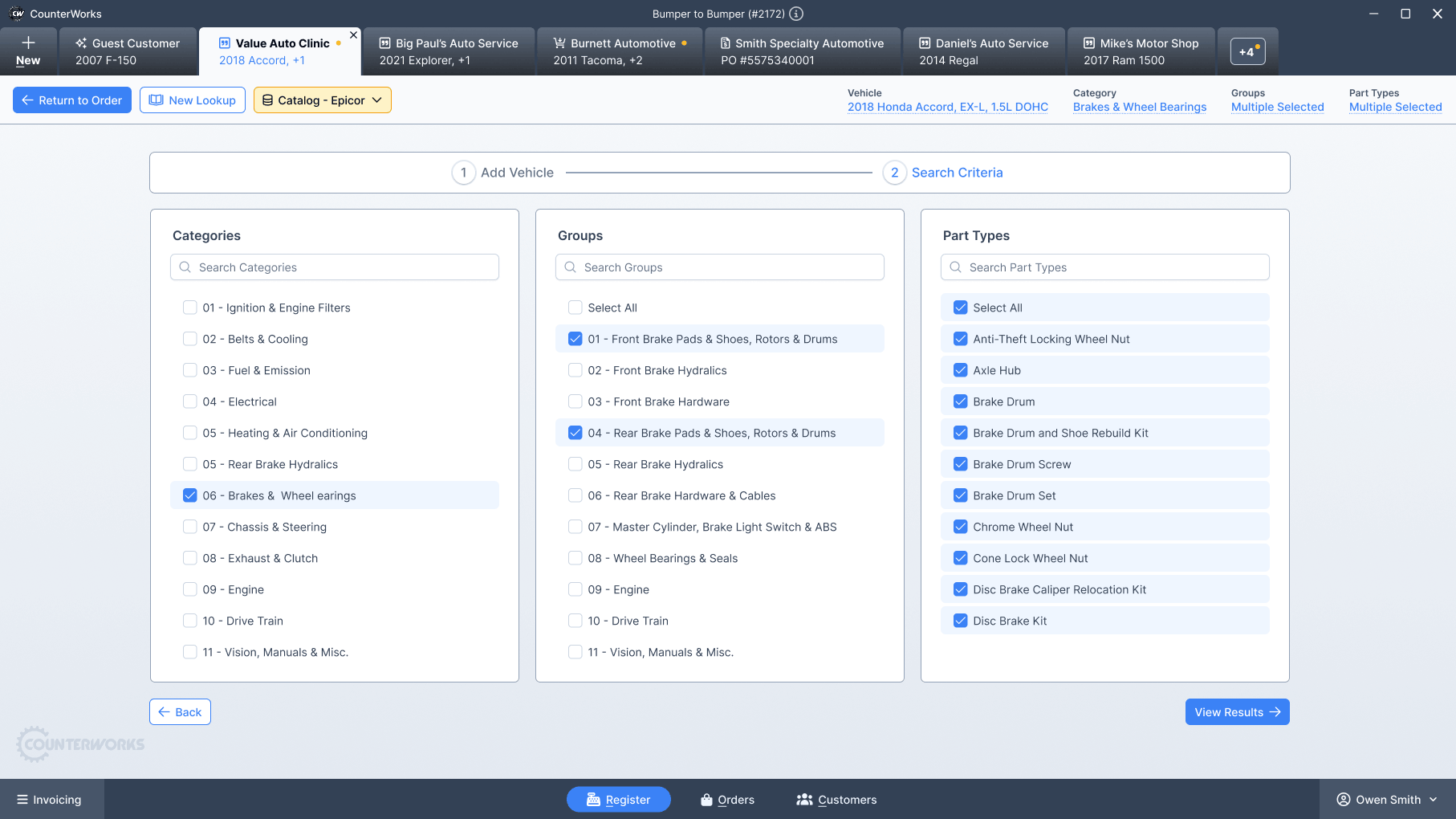
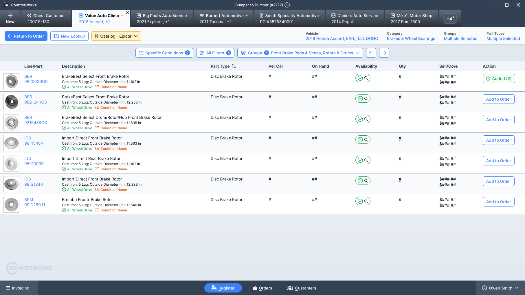
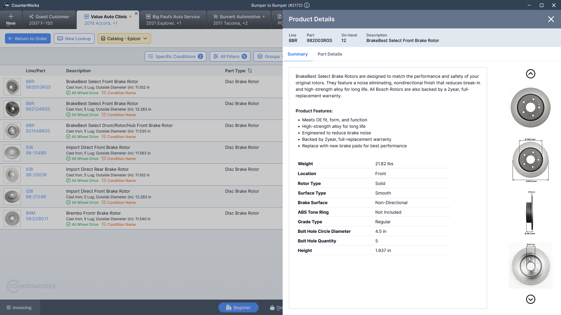
Instead of launching a separate window, catalog results were displayed in the same tab as the active customer. Search, filter, compare, and add to cart all happened in the same environment.
- No visual shift.
- No mental reset.
- No window juggling.
Once everything lived inside the POS, the experience finally felt cohesive.
The Solution
The final catalog experience was fully integrated into the new CounterWorks platform.
Key design decisions
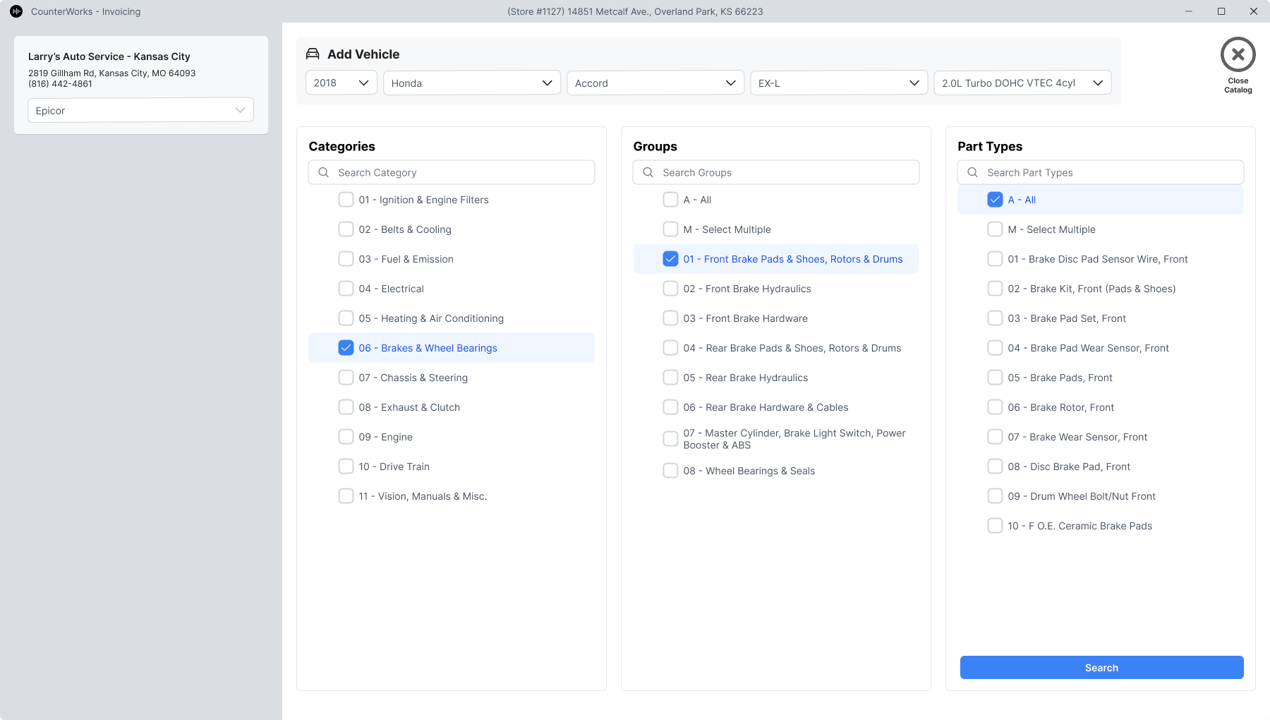
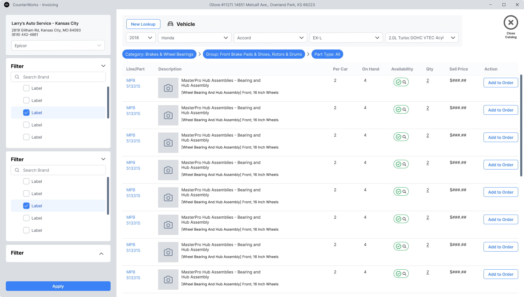
- Embedded catalog search directly inside the customer tab.
- Support for multiple data providers using ACES and PIES standards.
- Side-by-side part comparison without leaving the order.
- Clear vehicle context visible throughout the search processSimplified parts lookup and checkout flow.
- Instant add-to-order without copying between windowsFamiliar UI patterns to reduce learning effort.
Intentional restraint
- Avoided overloading the screen with filters upfront.
- Deferred advanced fitment details until users needed them.
- Kept layout consistent with the rest of the POS to reduce learning curve.
The catalog no longer felt like a separate product. It felt native.
The Outcome
The integrated catalog launched as part of the new CounterWorks platform.
Impact signals
- Reduced context switching during parts lookup.
- Faster add-to-order actions compared to the legacy pop-up workflow.
- Increased flexibility by supporting multiple data providers.
- Reduced reliance on a single vendor pricing model.
Counter staff reported that the new catalog “just felt like part of the system” instead of something they had to manage separately.
Operationally, the business gained more control over provider relationships and long-term cost structure.
Reflection
What worked
- • Treating the catalog as part of the order, not a separate feature.
- • Maintaining a consistent visual and interaction model across the entire POS.
What I would improve
- Add predictive search based on frequent store-level part history
- Introduce performance monitoring dashboards for provider response time.
In Closing
This project reinforced something simple but important.
Integration is a user experience decision.
When systems feel stitched together, users feel the seams. When experiences are cohesive, work flows naturally.
The new CounterWorks catalog removed those seams. It gave counter staff a single, stable place to search, compare, and sell parts without breaking stride.