Case Study
CounterWorks
A legacy POS system used by auto parts retailers to manage complex transactions.
I led a redesign focused on speed, clarity, and decision support at the counter.

Role: Lead Designer
Scope: End-to-end UX & UI
Collaborators: Product, Business, and Engineering
The Hook
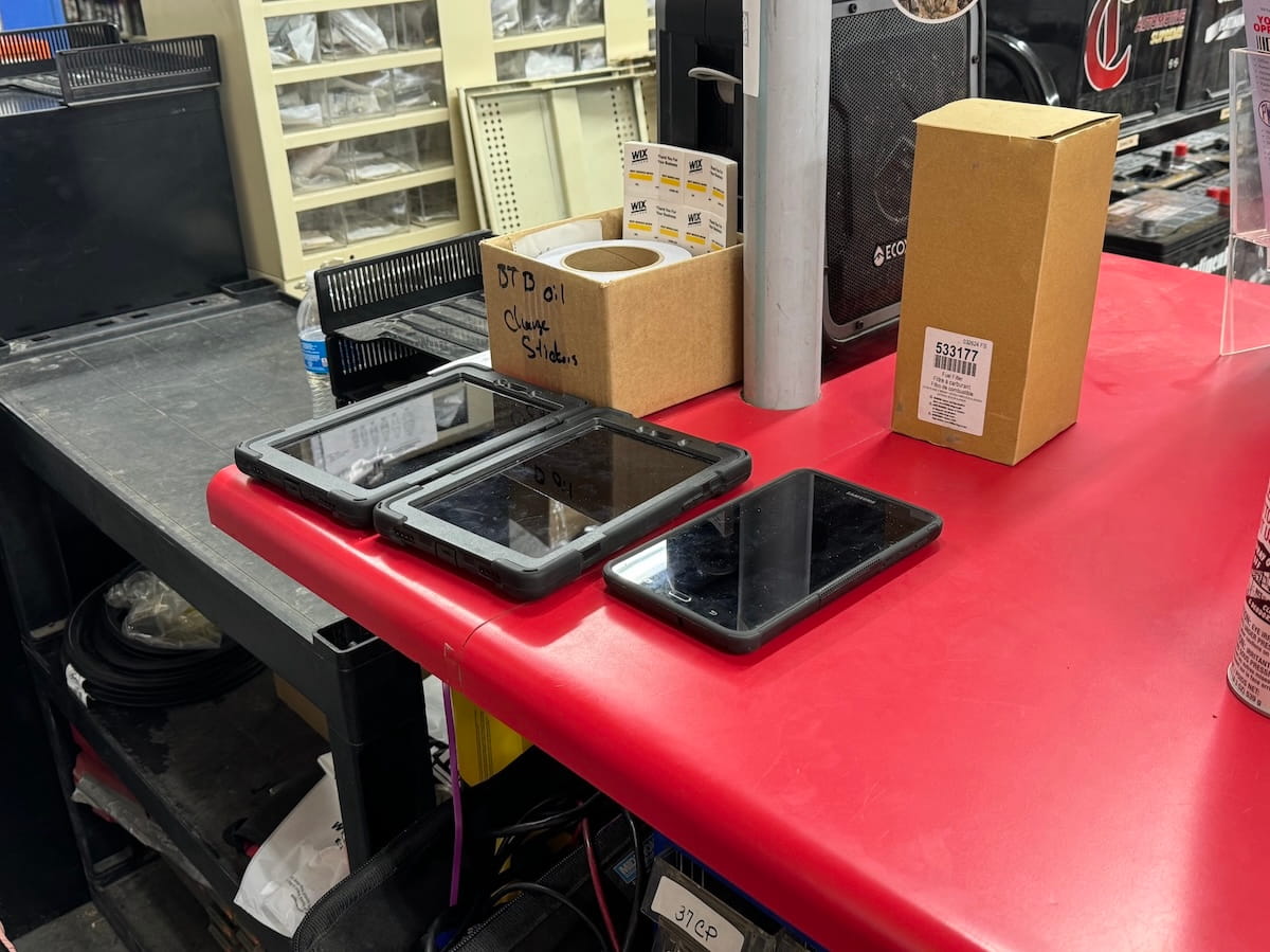
Counter staff work under pressure. Lines build fast. Orders change mid-flow. Pricing must be correct on the first pass.
The existing system slowed them down. It spread key actions across multiple panels and relied on user memory.
I redesigned the experience to reduce friction, improve pricing clarity, and support faster order completion.
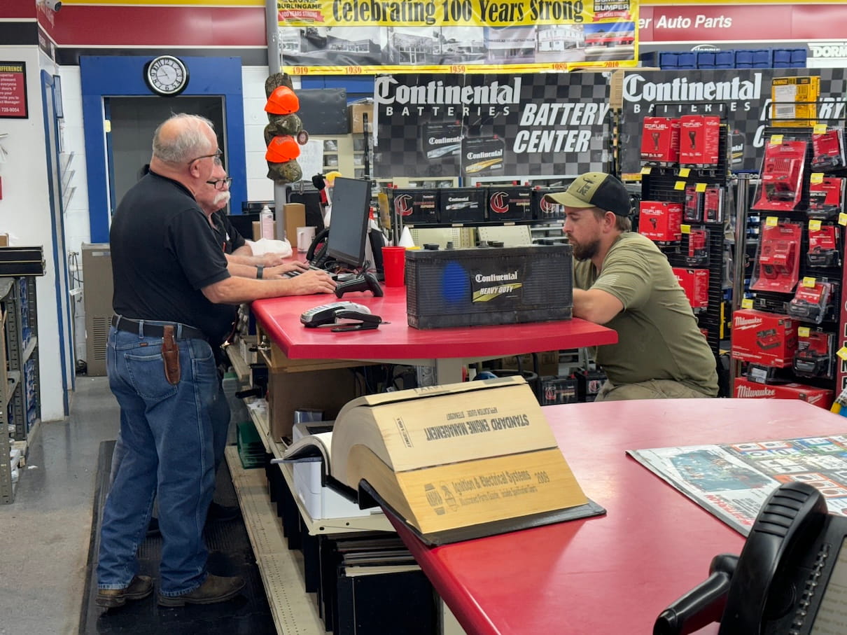
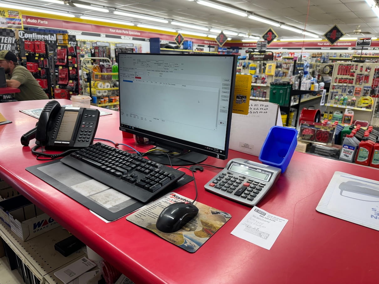
The Context
CounterWorks supports day-to-day operations for auto parts stores.
Employees handle:
- Multi-item orders.
- Multiple vehicles per customer.
- Real-time inventory checks.
- Pricing overrides and discounts.
Most interactions happen while a customer is standing at the counter.
Speed and accuracy both matter.
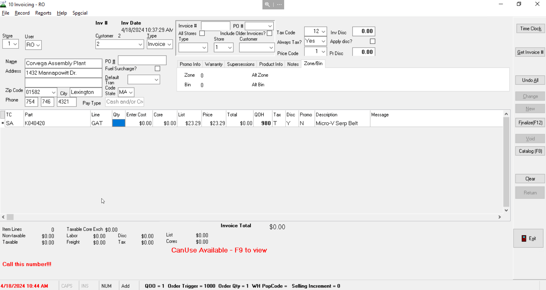
The Problem (Reframed)
The system created unnecessary friction during critical moments.
- Order details were split across disconnected areas.
- Pricing logic was hard to verify quickly.
- Key actions required too many steps.
- Users relied on memory instead of system guidance.
This led to slower transactions and higher risk of errors.
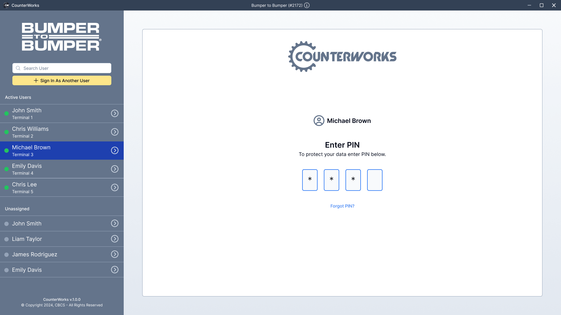
" I have 5 windows open; which customer was in this window? "
The Design Question
How might we help counter staff move faster while staying accurate under pressure?
The focus was not just layout. It was decision support in real time.
The Investigation
I observed store employees during live transactions.
I focused on:
- How they built orders.
- When they paused or hesitated.
- Where errors occurred.
- How they handled pricing questions.
A clear pattern emerged.
Employees worked around the system. They developed habits to compensate for gaps in the UI.
They needed a system that matched how they actually worked.
The Turning Point
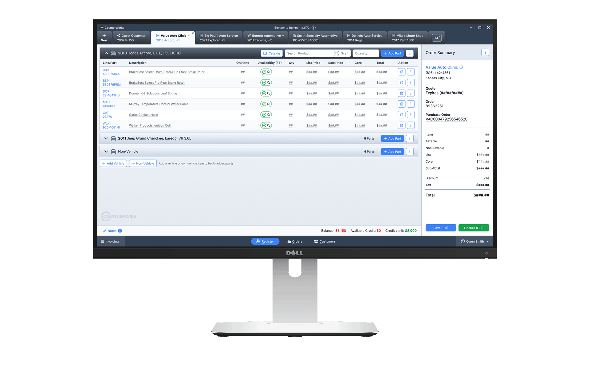
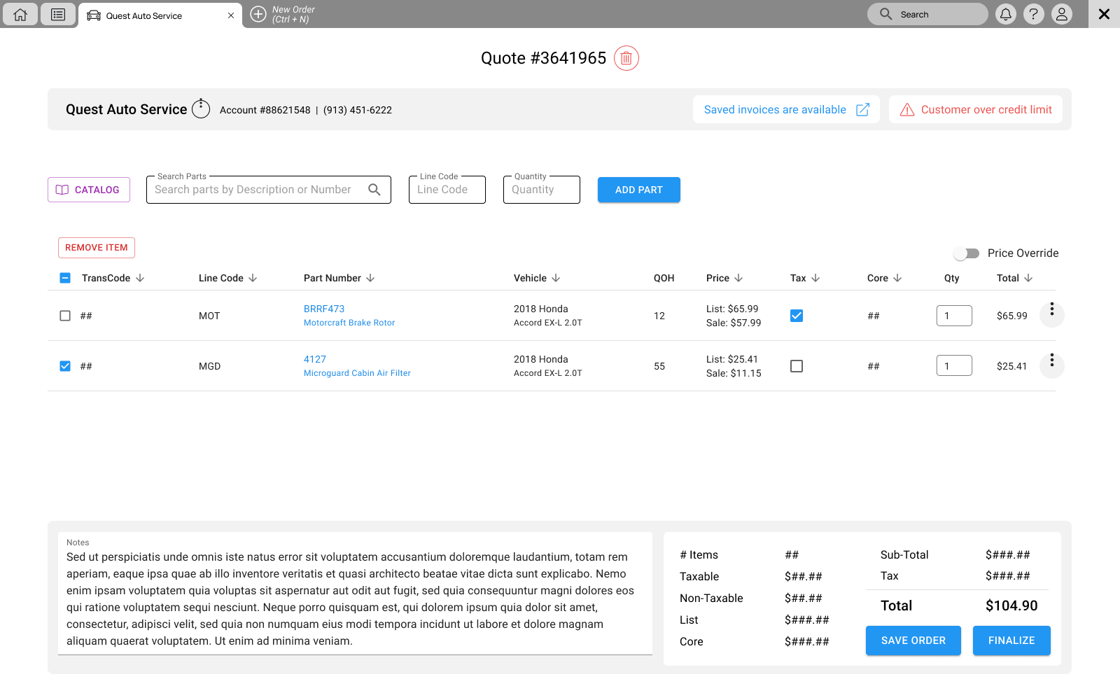
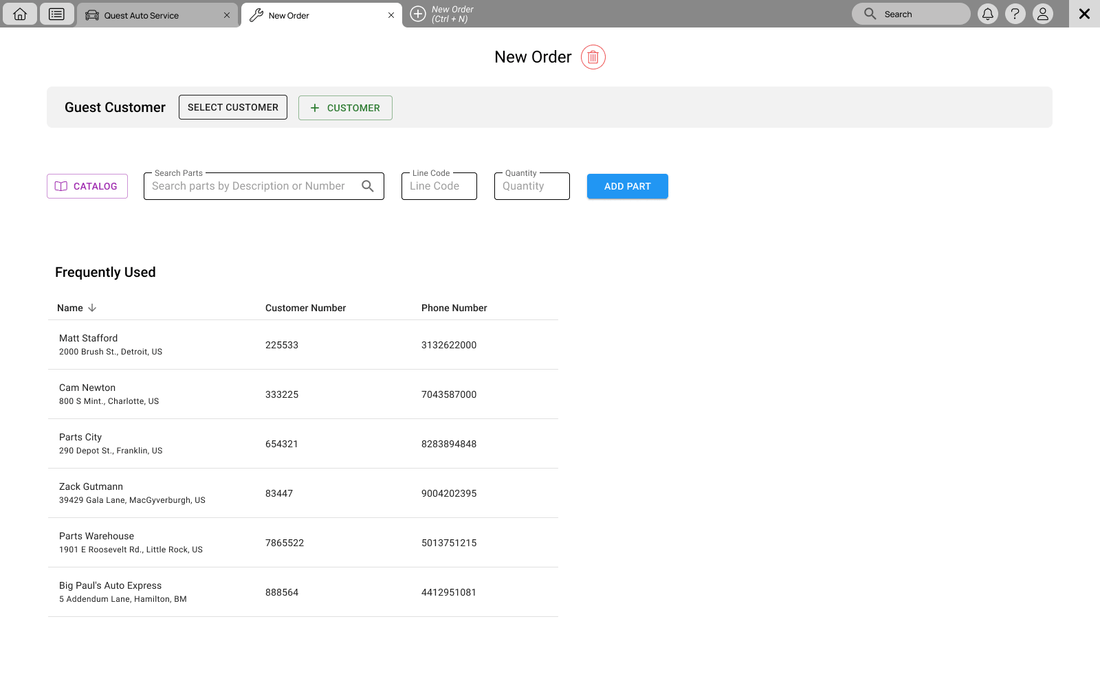
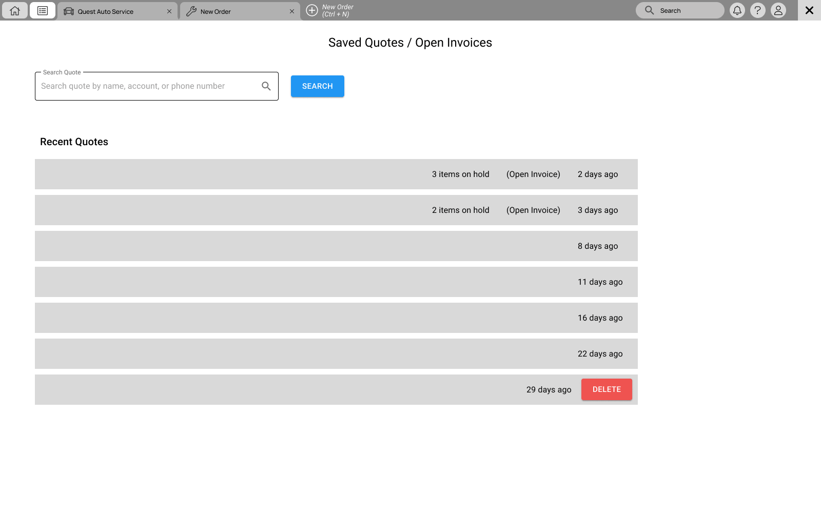
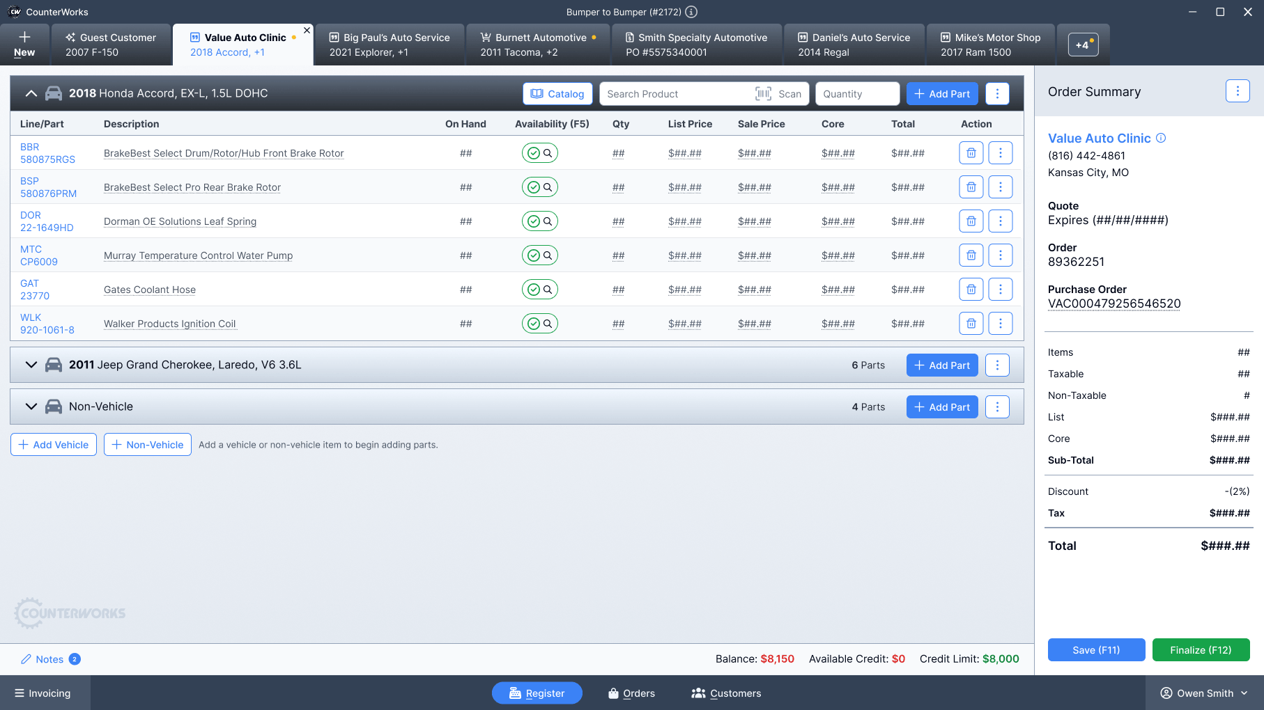
The biggest breakthrough came when I reframed the experience from multiple windows into a single workspace.
Instead of opening a new instance of the app for each customer, each customer had their own tab within a single window. Countermen could switch context instantly without losing their place.
This also made it possible to support multiple vehicles within a single customer tab, which matched how real orders and quotes actually worked.
Once everything lived in one place, the rest of the experience could be simplified.
The Solution
I redesigned the core workflow around a single, focused workspace.
Key changes
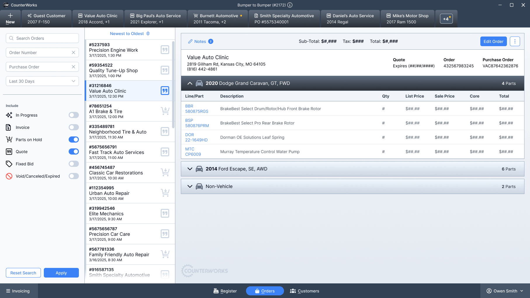
- Consolidated order details into one view to reduce context switching.
- Introduced a clear pricing summary for fast verification.
- Structured information to follow the natural flow of a transaction.
- Reduced the number of steps required for common actions.
Interaction improvements
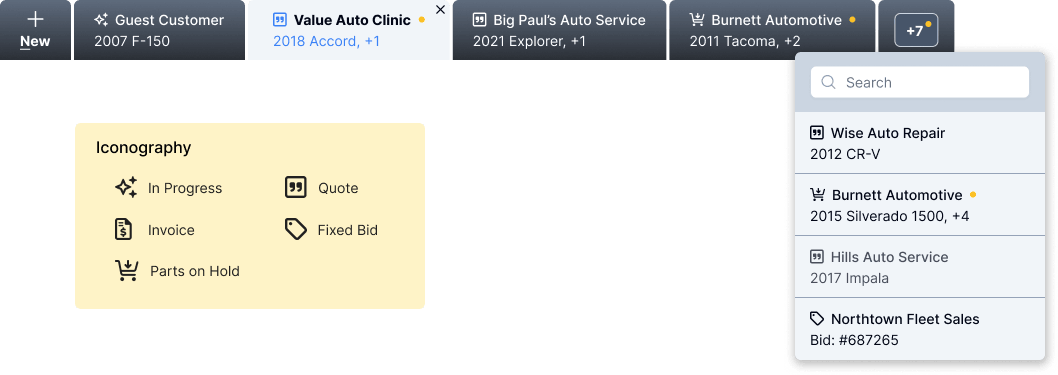
- Progressive disclosure to prevent overload.
- Consistent placement of actions across the interface.
- Clear visual hierarchy for scanning and speed.
- Inline feedback for pricing and changes.
Every decision aimed to help users move with confidence.
The interface was built with Angular and integrated PrimeNG components to enable faster development, consistency, and long-term maintainability. The desktop application was built with Electron.
The Outcome
The redesign improved both speed and clarity at the counter.
- Faster order completion during peak hours.
- Reduced pricing errors during checkout.
- Less reliance on memory and workarounds.
- Improved confidence for new employees.
The system better supported real workflows instead of forcing users to adapt.
Reflection
Designing for this environment changed how I think about UX.
Speed matters as much as clarity.
Users do not have time to explore. The system must guide them.
I also learned the value of observing real behavior. Assumptions break quickly in high-pressure environments.
In Closing
This project reinforced a core principle.
Good design removes friction at the moment it matters most.
In this case, that moment happens at the counter, with a customer waiting.
Hey there!
Make sure to check out the catalog experience that was added to Counterworks.